Case study · 4 min read
Goldbach SME Website
I redesigned Goldbach's 24-page website section for small and medium-sized businesses, making its content easier to navigate and maintain. My work covered research, page structure, interface design and ongoing improvements after launch.
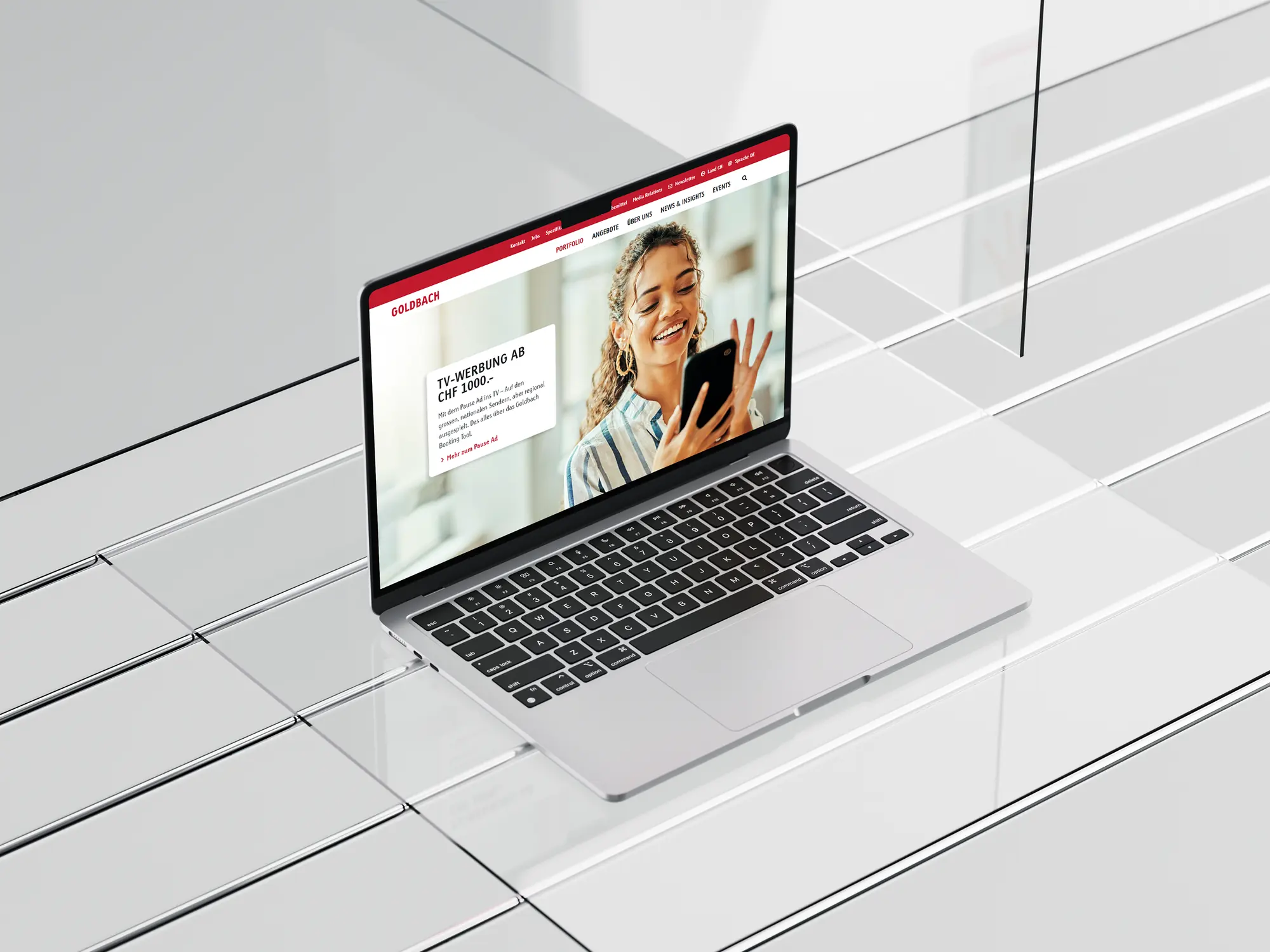
The redesigned Goldbach SME website across desktop and mobile.
Context and my role
A 24-page SME website redesign for Goldbach, paired with UX support for their B2B booking platform.
Goldbach needed a clearer way to present its advertising offer to small and medium-sized businesses. Across 24 pages, visitors had to find relevant information and understand their next step. The team also needed to update the content through the CMS without redesigning individual pages.
My role: research, design and ongoing collaboration with developers.
As CX/UX Designer, I worked across research, UX/UI and content. I analysed Hotjar heatmaps, developed wireframes and CMS layouts, and created page content, icons and visual assets. I collaborated with developers on functional and A/B testing and continued improving the website after launch.
Alongside the website project, I supported Goldbach's B2B advertising-booking platform through feature testing and educational content — testing new features, documenting usability issues and sharing practical recommendations with developers. I also created user guides, process diagrams and tutorial videos.
Approach
Understand the existing experience. I reviewed the page structure and Hotjar heatmaps to examine how visitors interacted with the content and identify areas for improvement.
Organise the information. I simplified the navigation and translated the revised structure into wireframes and CMS page layouts.
Design and test. I developed the content and interface elements, then worked with developers to test functionality and compare alternatives.
Improve after launch. I continued refining the website based on results, treating launch as the start of ongoing optimisation.
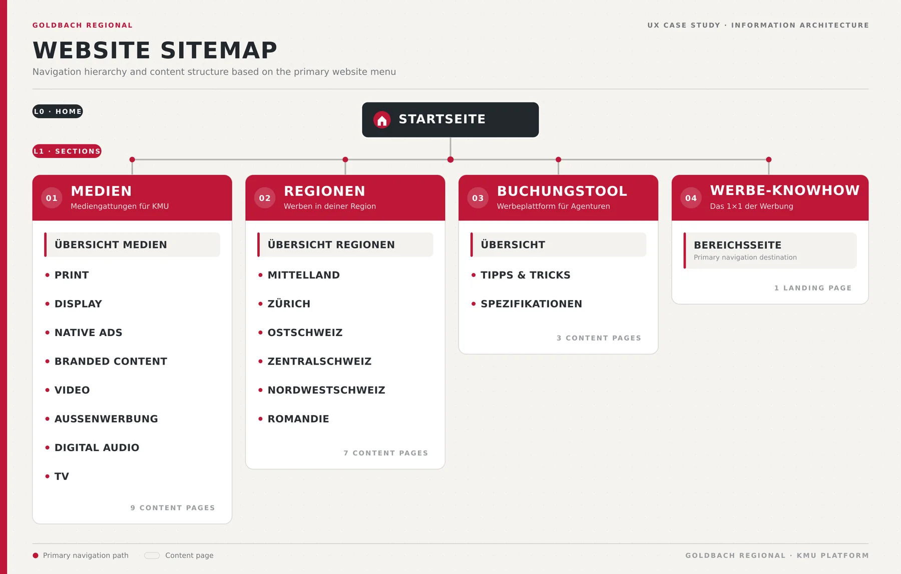
Website sitemap showing the navigation hierarchy and content structure of the KMU-Lösungen section.
Key design decisions
Build pages from reusable modules
I used shared headers, content blocks and page patterns across the section. This gave visitors a familiar structure and allowed the team to make routine content changes without starting each layout from scratch.
Use observed behaviour to guide changes
Heatmaps helped me review where visitors clicked and how far they scrolled. I used these observations to inform the page structure and the changes we tested.
Explain the booking process where users need it
I brought platform guidance into the website through diagrams, icons and tutorials. The aim was to help visitors understand the steps involved and answer common questions within the experience.
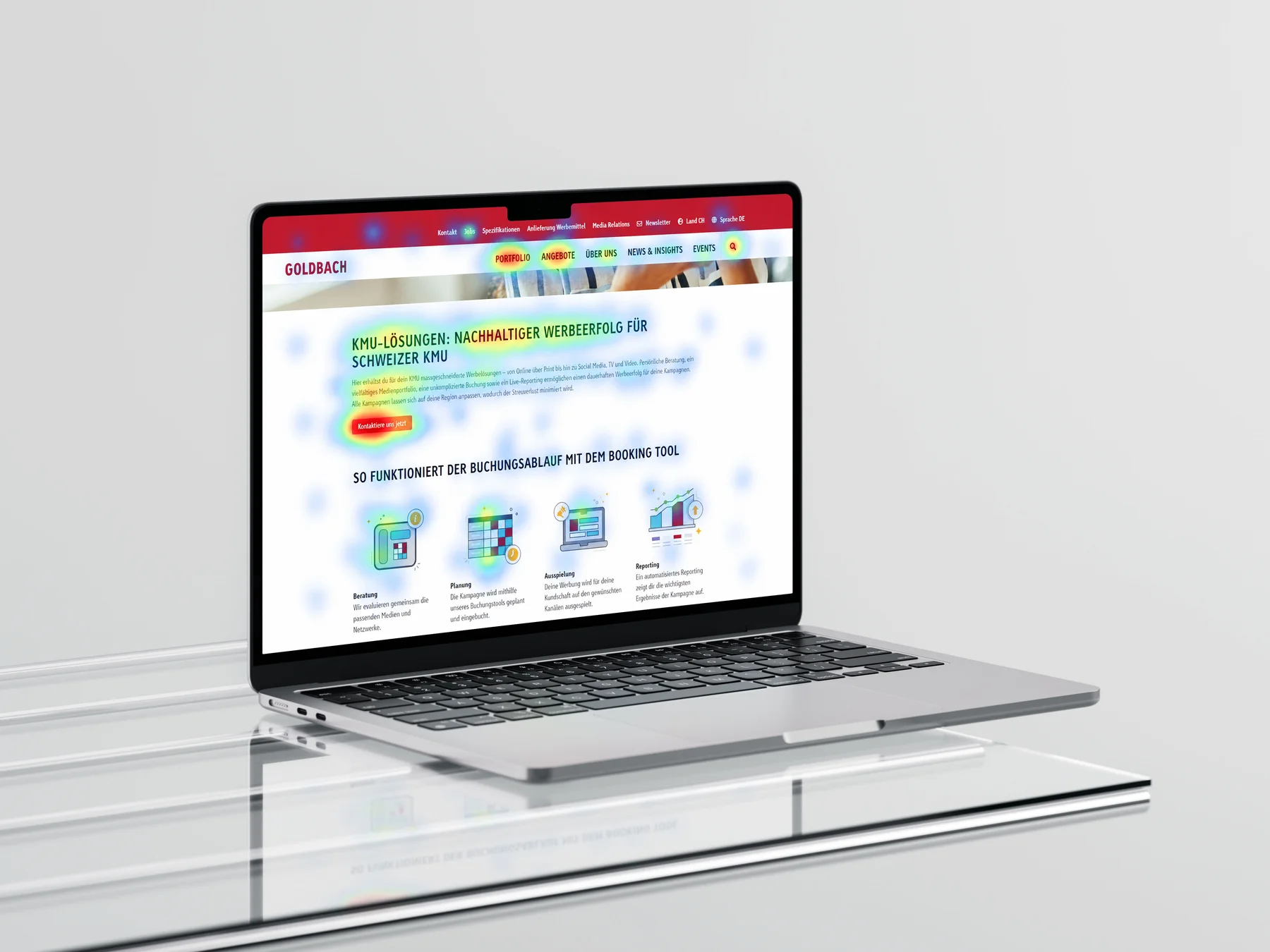
Hotjar heatmap of the KMU-Lösungen overview page, showing where visitors clicked and read.
The solution
A unified, reusable system across 24 pages — plus supporting material for the B2B booking platform.
The redesigned section combined a clearer information structure with reusable CMS layouts across all 24 pages. Content, navigation and visual elements worked together to help visitors explore Goldbach's offer.
Supporting material explained the B2B platform's workflow, while feature testing provided developers with feedback on the booking experience itself.
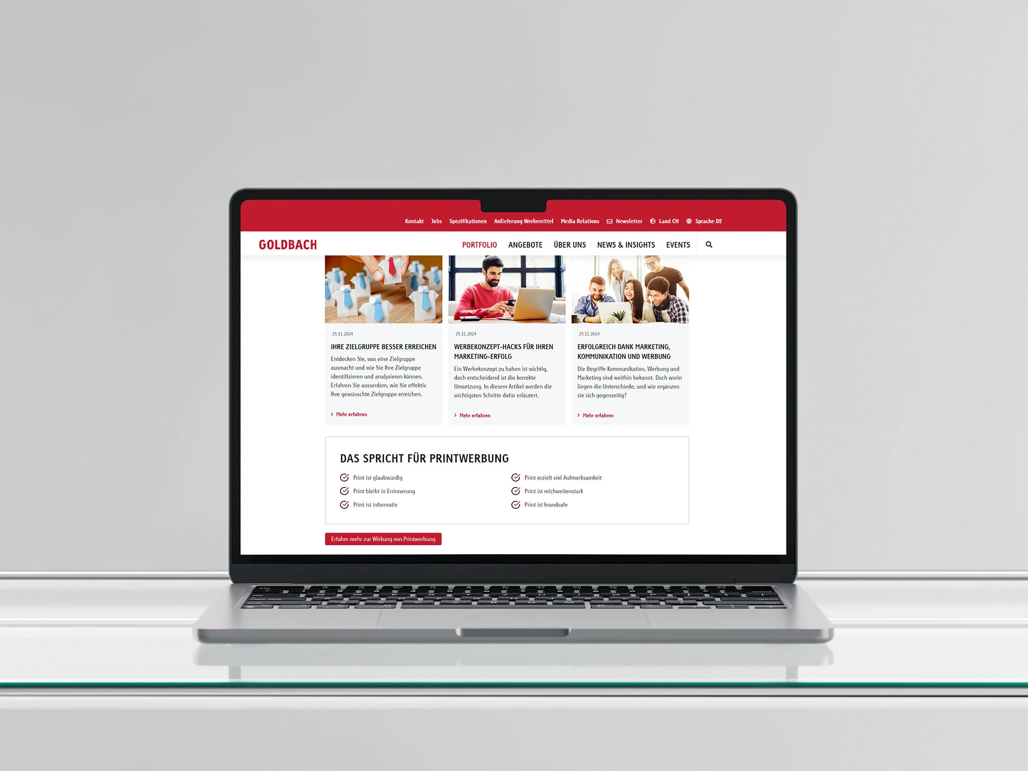
Live CMS modules from the KMU-Lösungen pages: the media reach module and the print-advertising benefits module.
Outcome
The platform guidance also reduced support demand. Each result relates to its own part of the work: website optimisation supported lead generation, while educational content supported understanding and engagement.
What I learned
Two audiences, clearer content, and a launch that was only the beginning.
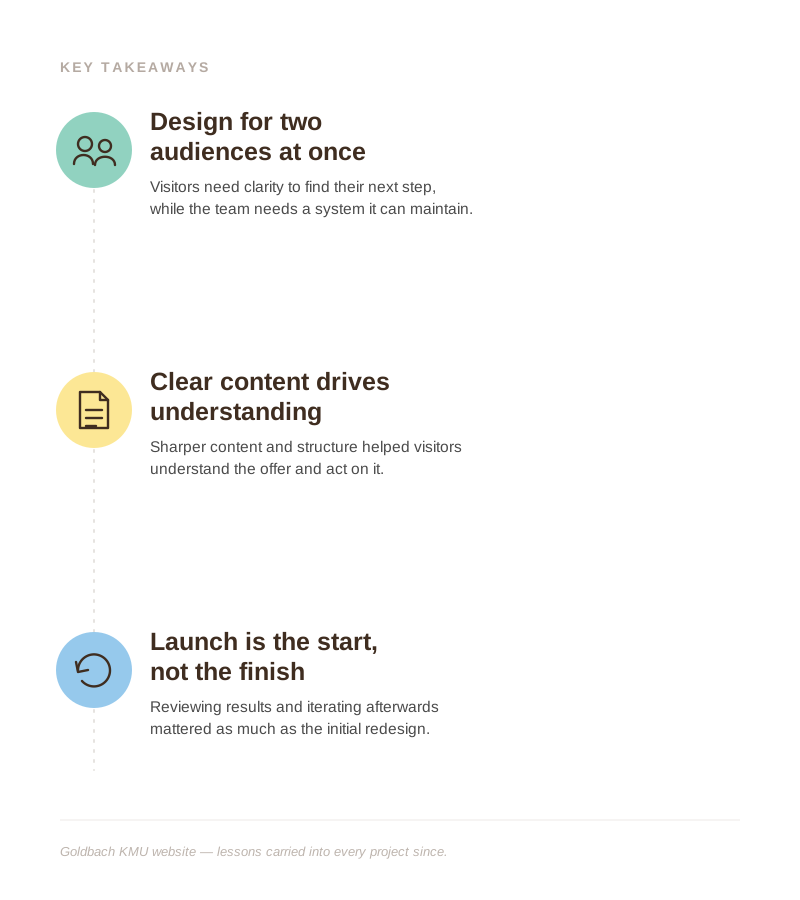
This project reinforced the value of designing for both customers and the people maintaining the service. Clear content helped visitors understand the offer, while reusable layouts made the website easier to manage. Continuing to review results after launch was as important as the initial redesign.